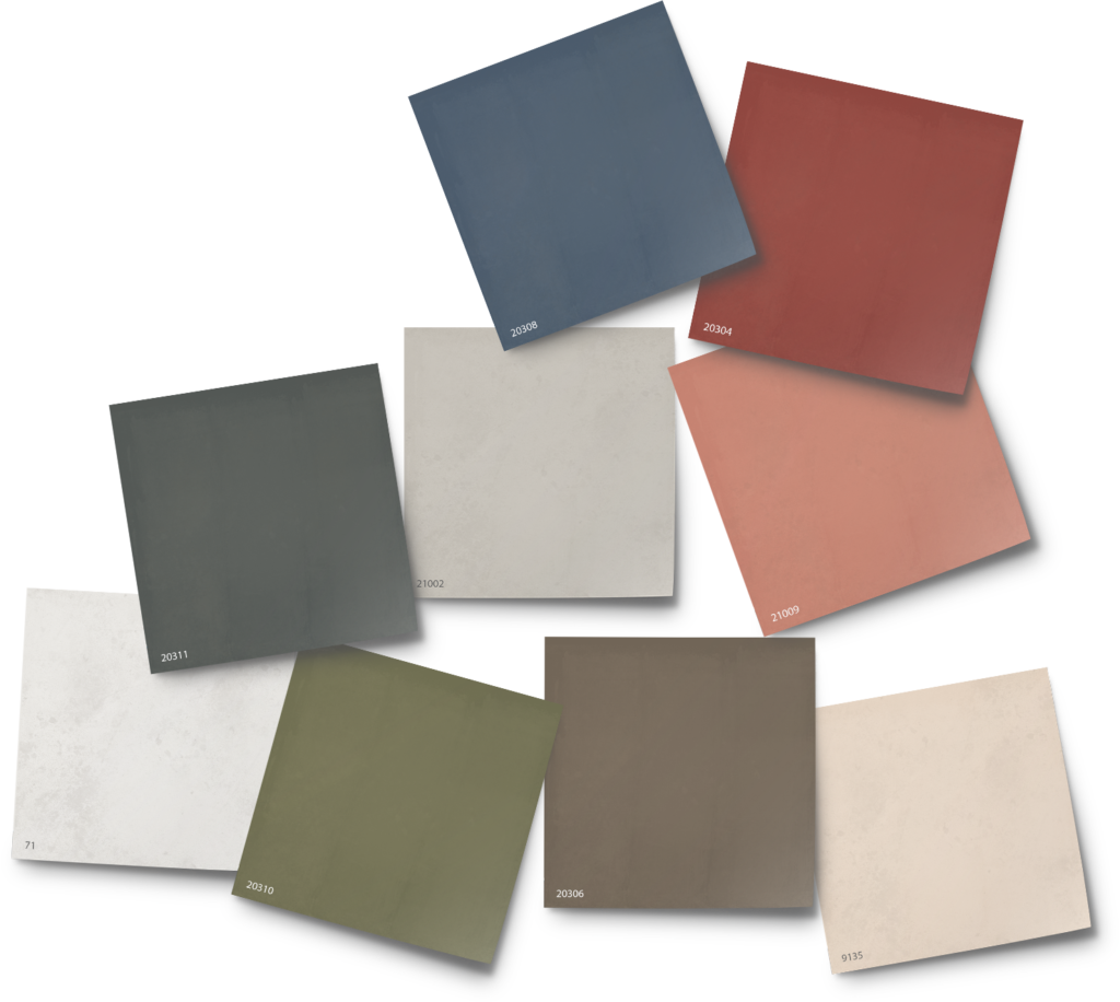
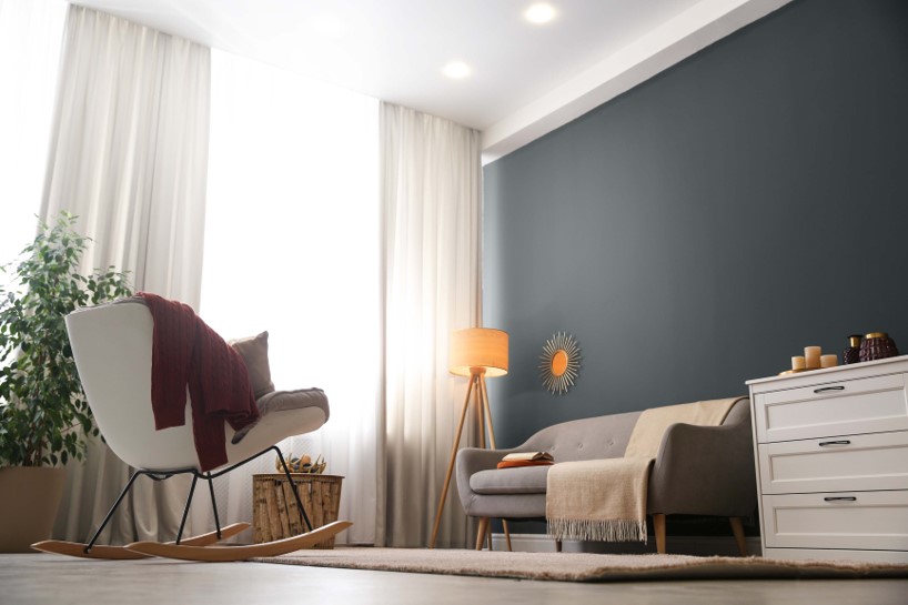
The enduring comfort of the perfect gray never goes out of style and is the perfect backdrop to seasonal “pops” of color. Our foolproof and handsome shade of gray has undertones of both yellow and blue to add complexity and depth to this wonderful neutral shade. Is it time to be daring with a dark hue in your home?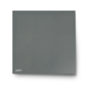
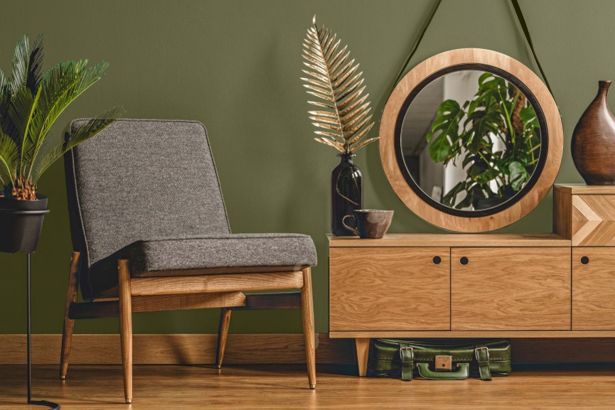
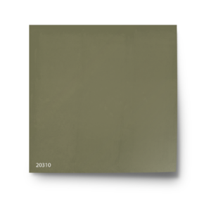
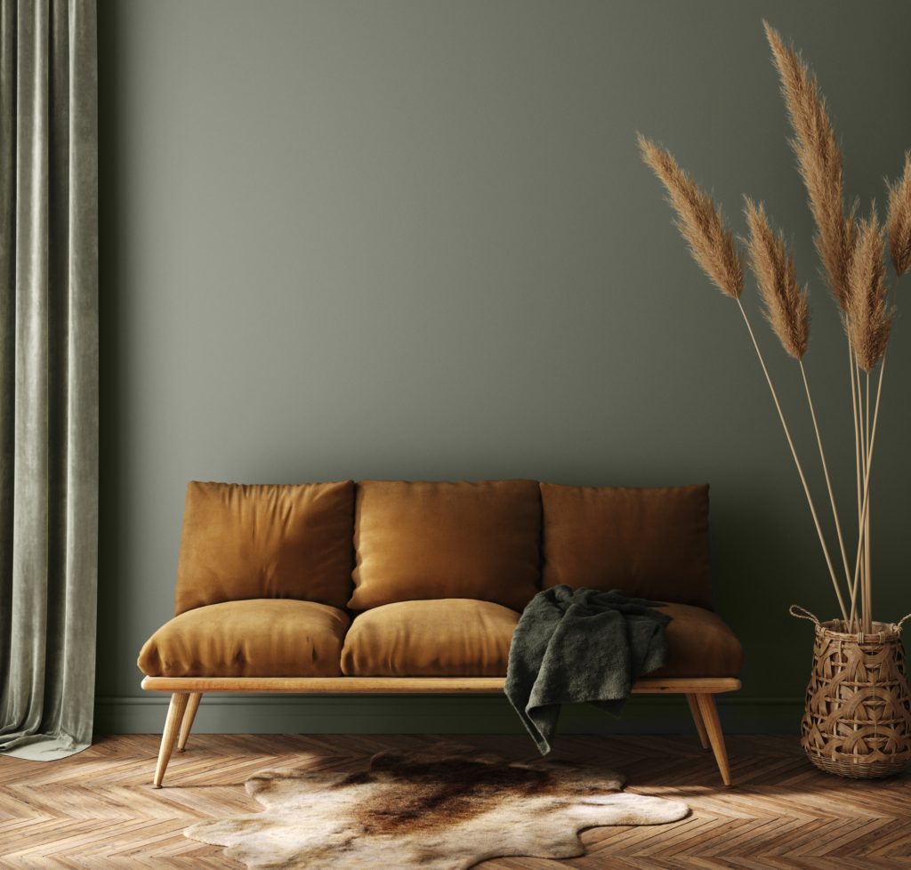
Like a favorite cashmere sweater on a cool day, this warning green color wraps you with a sense of calm and serenity. Embracing stronger colors in your home has never been healthier, and this modern take on the traditionsl olive hue offers much to love. Perfect for fall, of course, this olive hue lives beyond the season with a shade reminiscent of lish foliage at dusk. Here used to dramatic effect to create a truly mid-century modern vignette.
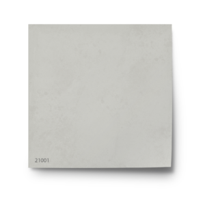
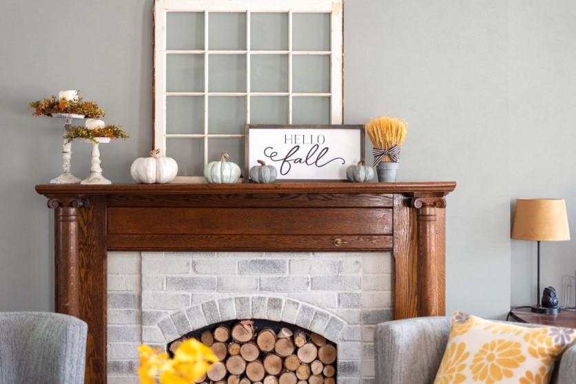
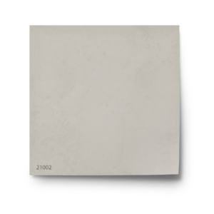
One of the easiest neutral hues to work with is color 21001 with its calming and clean aesthetic. The perfect partner to golds and yellow accessories, it also pairs with warm white and natural wood tones. Here the traditional fireplace mantel marries new tradition with modern. How better to welcome the transition of Fall?
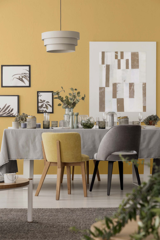
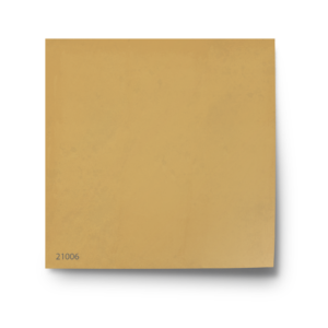
This luxurious deeply saturated golden color gives us a surprisingly vintage vibe, even when paired with modern décor. Cozy and not too yellow, used with some restraint, this color can be moody and provocative. It pairs splendidly with grays and olives for a seasonal twist. Such a saturated hue, however, can easily overwhelm a small room, so choose this wonderful color wisely, perhaps as a focal point or accent wall?
Color 21003 is especially beguiling in our European Limewash paint finish, with its understated texture and mottled tone-on-tone appearance. The crystalline matte flat nature of limewash imbues your walls with the look and feel of hand-finished plaster for truly custom and artistic walls. This wonderful gray green hue adds unsurpassed depth of color and is the perfect accent for traditional neutral shades and light natural wood tones.
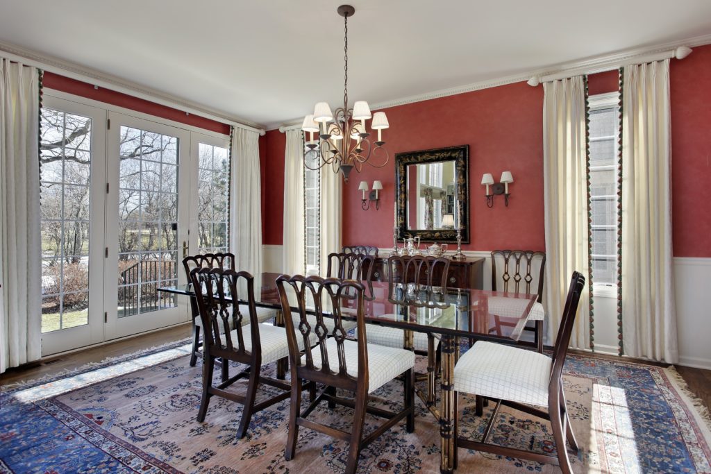
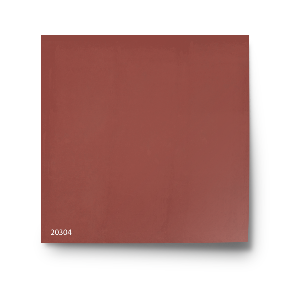
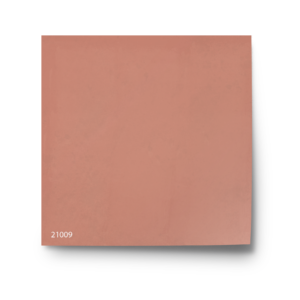
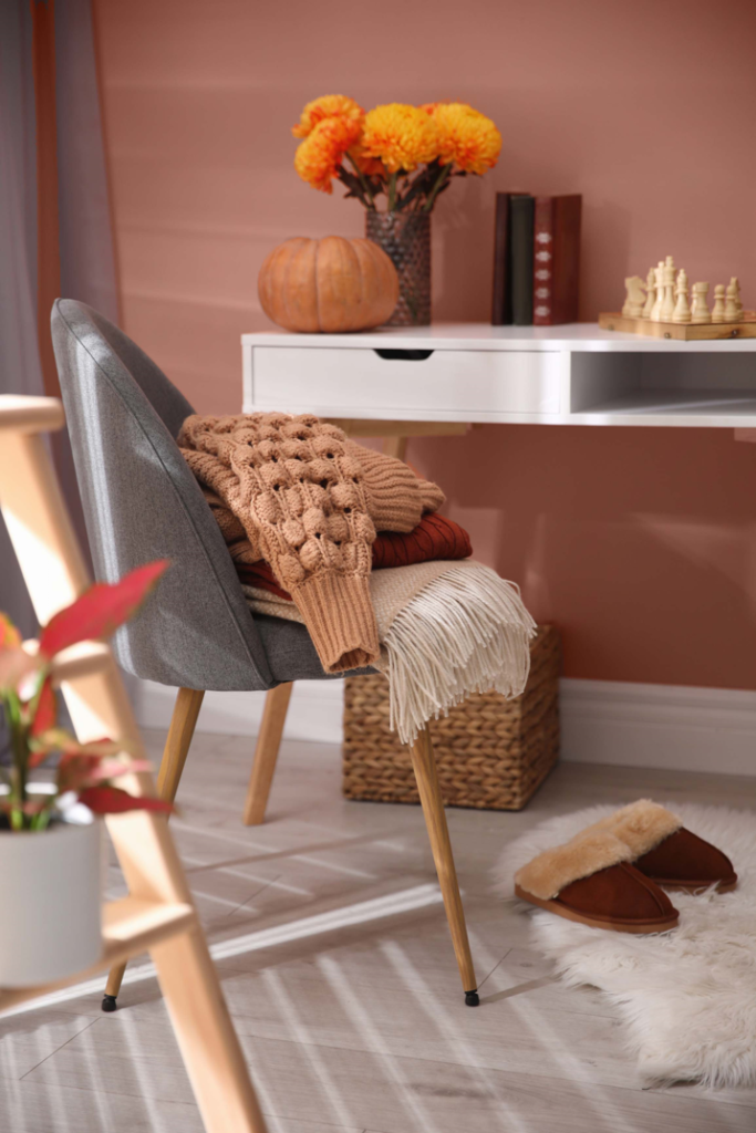
A striking earthen red hue balances a warm, earthy feel with the richness of yellow ocher undertones. Most often used as an accent color, this shade responds extraordinarily to changes in light throughout the day. At first light the color exudes shades of coral and deepens as the sun drops at day’s end. We can’t think of a cozier color, can you?
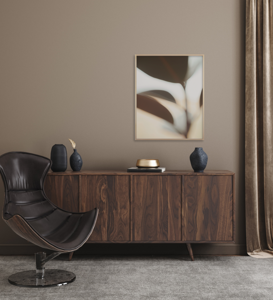
A wonderful warm brown shade makes this color instantly appealing. The richness blends effortlessly with so many other colors it especially loves to be paired with metallic shimmer and black accents. With a slight red undertone, pair this classic brown with deep wood tones for a modern or traditional feel. And with the beautiful texture of Mineral Wall Paint your walls give the impression of a luxurious sueded feel.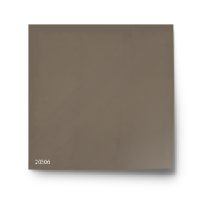
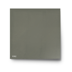
Color 9382 appears at first glance as a traditional hue with a time-honored neutral appeal. It is, though, perfectly at home in traditional settings and works especially well with natural materials. To warm up the winter blues, use this earthen shade with dried naturals and natural hued wood tones. It is especially alluring when paired with the rich texture of velvet.